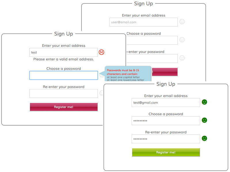
A Simple Sign Up Form

I made a goal a few months back to build something every day. Whether deep into a project or just some small little stand-alone, the more often I practice coding, the more I learn and the better I get. A couple days ago, I discovered DailyUI, which sends UI challenges to your email every day for 100 days. I'm already a couple days behind, due to signing up late in the evening and having a busy day. But, Day #001 is done.
I wanted a simple form with centered inputs. I didn't realize how resistent legend is to styling. In order to center it, I had to use a favorite little absolute positioning trick:
fieldset {
position: relative;
}
legend {
display: block;
width: 100px;
text-align: center;
position: absolute;
top: -15px;
left: 0;
right: 0;
margin: auto;
background: white;
font-size: 22px;
Another unexpected CSS hurdle popped up on setting the width on all inputs, including the submit. After digging into it, I learned that the submit input box-sizing default in Firefox is border-box, while the other inputs use content-box. Setting them all to border-box resolved that issue.
I played around a bit with the jQuery .validate() plugin to include a password regex function to extend the client side validation process a little further. After digging through the documentation, I ended up using the pattern method which works well when only needing a single regex pattern.
With apologies to my color-blind relatives, I used the common red and green signals to represent valid and invalid inputs, and the smile/frown characters aid visual accessibility. Once all inputs are valid, the submit button turns green to signal to the user that all is well and ready to go. You can play around with the result at CodePen.
See the Pen A registration form by Bekah Sealey (@bekahsealey) on CodePen.